Marketing
Shadow #DD3900
Orange 1655 CP
tint · callouts
 Field Manual
The hiilite.ai brand system · second cut · light
The working reference for the hiilite.ai brand: the AI and product-forward face of Hiilite. One living system, sixteen chapters. Five colors, one lockup system, a calm motion language, and the full UI kit, with code tables, do/don'ts, and the download shelf. Built to be searched, not scrolled.
Why the brand exists, and its organizing principle: one living system with a calm charcoal core and five brand-colored signals in motion. Each core value owns one color and one department.
"Find purpose. Work together. Effect growth."
Three verbs. Purpose, Collaboration, Growth: they echo through the five core values below.
Accountable, data-led, and delivered like an extension of your team. We say what works and back it with results. Tone in three words: Vibrant, positive, professional.
The brand's organizing principle: each core value owns one brand color AND one department. Colors are not interchangeable. Pull the value and color that match what a piece is about.
| Value | Color | Department | Descriptor | Definition |
|---|---|---|---|---|
| Collaboration | Orange | Marketing | Approachable · Empowering · Respectful | We create better products by working together. |
| Purpose | Purple | Design | Effective · Impactful · Strategic | We find meaning in all that we do. |
| Positivity | Yellow | Content | Optimistic · Persevering · Encouraging | We have perspective. |
| Badassery | Cyan | Tech / Dev | Authentic · Bold · Unconventional | We live outside the box. |
| Growth | Green | Leadership | Ambitious · Curious · Driven | We continually develop ourselves. |
How the brand sounds and how it writes. Short punchy sentences. Active voice. Second person. No fluff, no jargon, no vague promises.
"We say what works — and back it with results."
Hiilite · the one canonical capture line · Cardo, pull-quotes only| Surface | Tone |
|---|---|
| Website | Polished, assertive |
| Sales | Persuasive, energetic |
| Social | Conversational, sharp |
| Client comms | Clear, professional, collaborative |
"Most marketing wastes money. We don't. Every strategy we build is designed to drive measurable growth. No fluff. No guesswork. Just results."
The manifesto paragraph| Weak | Hiilite |
|---|---|
| "We leverage synergistic solutions to optimize engagement." | "We turn your marketing into real revenue." |
The combomark is the default. When in doubt, use the combomark. Reach for a variant only when the field demands it, and maintain shape, colour, and proportions exactly as shipped. Every mark here is a real asset file.



Use the 'Hii' icon in isolation only once its association with Hiilite is established. Until then, use the combomark. On social the icon must be Hiilite Orange, white, or an approved variant, sized equal to neighbouring icons.
Take the height of the "H" letterform in the wordmark and keep that exact amount clear on all four sides (the cyan band). Nothing invades it: no text, no other logo, no graphic. For a header combomark that is ≈16% of the total logo height; at 32×32 favicon size keep a 4px buffer.
| Mark | Min on screen | Min in print |
|---|---|---|
| Combomark | 80px wide | 0.75″ (19mm) |
| Wordmark | 60px wide | 0.5″ (12mm) |
| Hii icon | 24px (16px favicons only) | 0.25″ (6mm) |
Below the minimum sizes, switch to a larger variant.
On a light surface use the color combomark. On a dark surface use the white wordmark or white icon, never the color combomark on charcoal. If technical limits stop you rendering brand color at all, revert to black on light / white on dark. Never silently substitute a different color.
Five brand colors. Each owns one department and one core value; they are not interchangeable. Orange leads; the rest support. Body copy and surfaces stay on the five neutrals.
Official interface neutrals (Web Guidelines, Dec 2020). Body text, surfaces, borders. Never long-form copy in a brand color.
On dark surfaces, brand-tint callouts flatten to a dark well and keep their accent border (see Theming).
Orange #FF4D00 is the primary brand color: every primary CTA, accent bar, and key callout. For any general-purpose Hiilite artifact where no department owns it, orange is the default. A monochrome Hiilite layout is undercooked: use the lead plus at least one secondary.
Rough proportion: a dominant neutral canvas, the lead brand color for emphasis, one secondary accent for support.
| Color | Web hex | Shadow | RGB | CMYK | Pantone | Department | Value |
|---|---|---|---|---|---|---|---|
| Orange | Marketing | Collaboration | |||||
| Cyan | Tech / Dev | Badassery | |||||
| Yellow | Content | Positivity | |||||
| Green | Leadership | Growth | |||||
| Purple | Design | Purpose |
Shadow hexes are the darker variants for hovers and depth. Pantone swatches are Coated (CP) for print.
Lato is primary: everything, ten weights. Cardo is the secondary serif, used sparingly for editorial gravity. The wordmark is a customized Multicolore. Never re-typeset it.
Weights: Thin 100 · Light 300 · Regular 400 · Bold 700 · Black 900, plus italics. Bundled by @font-face; also on Google Fonts. No fake bold: use the real weight.
Pull-quotes and editorial moments only. Loaded from Google Fonts, tagged preview-only in this manual. No third typeface, ever. Multicolore exists only inside the shipped wordmark files.
Body text stays on the neutrals; the link color is the orange lead. Like this. Never set long-form paragraphs in a brand color.
Proposed, on-brand direction; photography is not in the 2020 guide. Vibrant, positive, professional. Real people and real work over generic stock.
Let one brand color punctuate a neutral scene: a prop, a screen, a wall. Bright, clean light. Energetic but never chaotic. Replace this direction with approved shoot references when they exist.
For interface icons, distinct from the Hii brand mark. A recommended system aligned to the brand's clean, geometric feel. No official UI icon library has shipped yet.
Line icons at 1.5 to 2px, rounded joins, one filled cell showing the active/selected treatment.
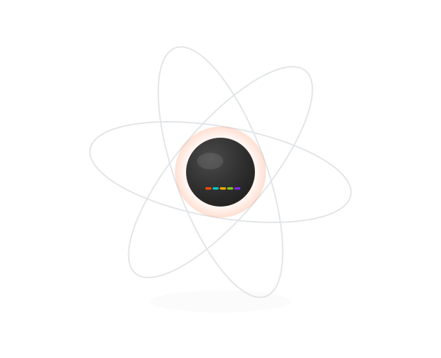
The signature graphic device: brand-colored nodes and energy moving around a calm charcoal core. The Sense → Seize → Transform growth loop and the 3R / 3P / Growth-Map diagrams are the canonical motifs.
The five brand colors are the moving parts; neutrals (the charcoal core, the light field) stay still. Official hexes only, no off-palette colors in any diagram.
A recommended data-viz system on the five-color palette: a natural fit for a performance-marketing brand. Pair with the platform's semantic status tokens for success / warning / error.
Categorical series follow the palette order: Orange → Cyan → Yellow → Green → Purple.
The hiilite.ai brand moves like a calm system: lightweight animated SVG, crisp at any size. The five colors are the moving parts; the neutrals stay still. Loops are eased and ambient, never bouncy, never fast.
Five brand-colored nodes travel tilted 8 to 12 second orbits around a glossy charcoal core. The orbit rings are neutral #d6dadd and never move; only the colored beads travel. This home-page hero is the canonical reference for the whole system.
Source asset: home-atom.svg · a self-contained SMIL loop, no JS, degrades to a static composed frame with reduced motion.
The core is a radial gradient from #191919 → #2c2c2c → #4a4a4a with a soft top-left highlight, carrying the five-color spectrum bar. It stays still while the colors move: the calm center of every hiilite.ai motion piece.
The equalizer is the same law at a different altitude: colored bars breathe on a still neutral ground. Cadence stays in the 5-12s calm band, eased. Use it for voice, activity, and "the Hii is working" states.
The Signal-Map is the primary motion mark. The wordmark boots on the charcoal core: a CSS-drawn equalizer of the five brand-color bars spikes, a scan cursor sweeps, the glossy core settles, and three brand-color dots "install" over the wordmark. On the live site, hover drives a live signal-response. Colors move in; the core is still. With reduced motion it renders the booted end-state: no animation, fully legible.
The recommended spatial system for digital work. Hierarchy comes from size, spacing, and contrast, not from color alone.
Buttons, dynamic states, and tokens (Web Guidelines, page 3, plus the orbit async-state spec). Radius 4px, Lato Bold, +0.02em, 120ms transitions. One primary CTA per screen.
Specimen pinned to the light field. Artwork wells stay light (see Theming, chapter 16).
When an action is working or resolving, the button reports it in place, never with a full-page spinner. A spinning cyan-to-orange orbit border signals loading; the shape then resolves to green success or red error. Geometry never changes between states.
Lifecycle · text button
Lifecycle · icon button
| State | Border | Surface · text | Rules |
|---|---|---|---|
| Default | Orange, solid 1.5px | Surface white · orange | Interactive; hover inverts to solid orange |
| Loading | Cyan → orange orbit, spins 1s | Surface · muted grey | disabled + aria-busy="true"; label ends in "…" |
| Active | Inherits state border | Inherits | Presses down 1.5px on :active. Try any button. |
| Success | Green gradient | #F1F8E1 · green | Holds ~2s, then returns to default |
| Error | Red → yellow gradient | #fdecec · red | Stays interactive so the user can retry |
The uploaded "Orbit Exact Shapes" export is the source spec for the treatment above. Geometry: a ::before border plate plus a ::after surface inset; loading swaps the border for a conic gradient that rotates once per second. Class API: .is-loading / .is-success / .is-error with disabled + aria-busy="true" while loading; refresh glyphs carry .orbit-refresh-icon and spin at 0.92s. Shape modifiers: wide Test (256px), wide Configure (448px), square icon (128px), and a red danger tint. In the platform this ships as OrbitButton driven by useAsyncAction with the global .orbit-loading utility (the "aiorbit" system).
| Export token | Export value | Brand adaptation |
|---|---|---|
| --orbit-exact-cyan-light | brand cyan | |
| --orbit-exact-cyan-dark | brand cyan | |
| --orbit-exact-orange | brand orange | |
| --orbit-exact-green (+soft) | success pair on brand green | |
| --orbit-exact-red (+soft) | platform status token (no brand red) | |
| --orbit-exact-radius-shape | 4px on standard buttons; keep the export radius for exact-shape tiles |
Export values are spec data, shown as labeled specimens only. Page chrome never uses them.
Reference the variables, never hand-type hex. The full token set (all 5 brand colors + shadows + neutrals + tints + @font-face) ships in hiilite-ai-brand/colors.css.
| Token | Value | Use |
|---|---|---|
| Primary accent / CTA | ||
| Text / dark surface | ||
| Body text | ||
| Surface / canvas | ||
| All text | ||
| Editorial serif | ||
| Buttons / inputs |
The system applied: decks, email signatures, and social avatars. Same colors, same marks, same voice everywhere the brand shows up.
Hiilite Creative Group
Marketing that actually works.
Charcoal cover, 5-color spectrum bar, orange eyebrow, Lato Black headline, white wordmark. Body slides invert to white with charcoal text.
First LastLato throughout, charcoal text, orange links, and the Hii icon (not the full combomark) at small size. No image-heavy banners.
Hiilite Orange, white, or an approved variant, sized equal to neighbouring icons. Maintain shape, proportions, and clear space at every size, and never deconstruct the icon on social. Profile-image files ship in assets/favicon/.
Sound is not yet defined. This chapter is reserved for a future audio identity as the brand scales into video and product. No sonic assets exist yet.
Until then, nothing here is canon. Treat every direction below as a recommendation waiting for sign-off.
Where the approved files live, what rights govern them, and who owns each slice of the brand.
The five core values map to the five departments that own their slice of the brand: Marketing (Orange), Design (Purple), Content (Yellow), Tech (Cyan), Leadership (Green). Brand questions and asset requests route through the owning department; Design holds final say on visual identity.
| Guideline source | hiilite-ai-brand skill · hiilite.ai/brand-guidelines/ |
| Authoritative spec | Hiilite · Web Guidelines (Dec 2020) |
| Contact |
Version this guideline as the brand evolves; log changes so partners always work from the current system.
If it is not in the changelog, it is not the brand. This page is Brand Guide v2.0.0; every deploy adds a dated row.
| 2.0.0 | 2026-07-23 | Field Manual redesign: the full 16-chapter guide from the approved v8b direction. Native Impreza sections on the page plus the interactive manual embedded; content imported from the Hiilite AI Brand Guidelines design project. |
| 1.0.2 | 2026-07-20 | Changelog version and date cells no longer wrap mid-date; the change column absorbs the width. |
| 1.0.1 | 2026-07-20 | Fixed the Charcoal preview in The Mark: the swapped white wordmark kept the combomark's box and rendered skewed; marks now keep their true proportions on every field. |
| 1.0 | 2026-07-19 | hiilite.ai guide launched. Inherits the Web Guidelines (Dec 2020); adds the motion language, tokens, and accessibility ratings. |
The system ships in two surfaces. Light and Dark force a mode; Auto follows the viewer's operating system and switches live when it does. This manual is authored for both. The control in the top bar is the real thing.
Showing: Light
The same control lives in this manual's top bar. Auto maps to the OS setting via prefers-color-scheme and flips live, no reload.
hiilite.ai
One living system, two surfaces. The accents never change.
| Role | Light | Dark |
|---|---|---|
| Page | ||
| Surface / card | ||
| Ink (primary text) | ||
| Secondary text | ||
| Hairline / border | ||
| Accents (all five) | unchanged: fully vivid on both surfaces | |
All roles resolve to the official five neutrals. The design-project viewer uses its own near-neutral wrapper values; this manual normalizes them to canon.