
MarketingShadow #DD3900
Orange 1655 CP
tint · callouts
Everything on the table. Nothing left to guess.
Light, Dark and Auto themes, instant search, the live orbit and motion demos, the WCAG contrast lab, and one-click hex copy. Everything on this page, alive. The Light / Dark / Auto control themes this entire page, not just the manual. Open the manual in a new tab.
Why the brand exists, and its organizing principle: one living system with a calm charcoal core and five brand-colored signals in motion. Each core value owns one color and one department. Colors are not interchangeable: pull the value and color that match what a piece is about.
Vision
“To become the best most badass marketing agency in the world.”
Mission
“Find purpose. Work together. Effect growth.”
Three verbs. Purpose, Collaboration, Growth: they echo through the five core values below.
Performance marketing that turns spend into measurable revenue.
Accountable, data-led, and delivered like an extension of your team. We say what works and back it with results. Tone in three words: vibrant, positive, professional.
How the brand sounds and how it writes. Short punchy sentences. Active voice. Second person. No fluff, no jargon, no vague promises.
“We say what works — and back it with results.”
| Weak | Hiilite |
|---|---|
| “We leverage synergistic solutions to optimize engagement.” | “We turn your marketing into real revenue.” |
Sample lines: Marketing that actually works. No guesswork. Just growth. Built to convert. And the manifesto: “Most marketing wastes money. We don’t. Every strategy we build is designed to drive measurable growth. No fluff. No guesswork. Just results.”
The combomark is the default. When in doubt, use the combomark. Reach for a variant only when the field demands it, and keep shape, colour and proportions exactly as shipped. Every mark below is a real asset file: never redrawn, never re-typeset.

Combomark · color · the default lockup. First choice for headers, decks, mastheads and sign-offs.
Stacked combomark · vertical and square spaces: social avatars, square cards.
Wordmark · white · reversed on dark fields. On charcoal use this, never the color combomark.

The Hii icon · favicons, avatars and tight spaces. Earn the icon: use it alone only once the association with Hiilite is established.
Clear space: the H rule.
Take the height of the H letterform in the wordmark and keep that exact amount clear on all four sides. Nothing invades it: no text, no other logo, no graphic. For a header combomark that is about 16% of the total logo height; at 32px favicon size keep a 4px buffer.
| Mark | Minimum on screen | Minimum in print |
|---|---|---|
| Combomark | 80px wide | 0.75″ (19mm) |
| Wordmark | 60px wide | 0.5″ (12mm) |
| Hii icon | 24px (16px favicons only) | 0.25″ (6mm) |
Below the minimum sizes, switch to a larger variant.
Match the mark to the field.
On a light surface use the color combomark. On a dark surface use the white wordmark or white icon, never the color combomark on charcoal. If technical limits stop you rendering brand color at all, revert to black on light or white on dark. Never silently substitute a different color.
Five brand colors. Each owns one department and one core value; they are not interchangeable. Orange leads; the rest support. Body copy and surfaces stay on the five neutrals.
| Name | Hex | RGB | CMYK | Pantone | Shadow | Department | Core value |
|---|---|---|---|---|---|---|---|
| Orange | #FF4D00 | 255 · 77 · 0 | 0 · 84 · 100 · 0 | 1655 CP | #DD3900 | Marketing | Collaboration |
| Cyan | #00CEC8 | 0 · 206 · 200 | 67 · 0 · 29 · 0 | 319 CP | #06B7B7 | Tech / Dev | Badassery |
| Yellow | #FFAA00 | 255 · 170 · 0 | 0 · 38 · 100 · 0 | 7549 CP | #EF970A | Content | Positivity |
| Green | #80CC1D | 128 · 204 · 29 | 54 · 0 · 100 · 0 | 376 CP | #80B720 | Leadership | Growth |
| Purple | #7E29ED | 126 · 41 · 237 | 68 · 79 · 0 · 0 | 266 CP | #6627C9 | Design | Purpose |
Shadow hexes are the darker variants for hovers and depth. Pantone swatches are Coated (CP) for print.
| Neutral | Hex | Use |
|---|---|---|
| White | #FFFFFF | Canvas; button text on saturated backgrounds |
| Light grey | #F7F7F7 | Alternating table rows; subtle section dividers |
| Mid grey | #DDDDDD | Rules, borders, disabled states |
| Dark grey | #393939 | Muted body text, secondary labels |
| Charcoal | #282828 | Primary body text; dark surfaces |
Never set long-form copy in a brand color; tints are for callout backgrounds only.
Lead with orange. Always.
Orange #FF4D00 is the primary brand color: every primary CTA, accent bar and key callout. For any general-purpose Hiilite artifact where no department owns it, orange is the default. The rough proportion is 60/30/10: a dominant neutral ground, a secondary surface, the orange lead as the accent.
Lato is primary: everything, ten weights. Cardo is the secondary serif, used sparingly for editorial gravity. The wordmark is a customized Multicolore. Never re-typeset it, and never add a third typeface.
Thin 100 · Light 300 · Regular 400 · Bold 700 · Black 900, plus true italics for each. No fake bold and no faux italic: use the real weight.
Cardo loads from Google Fonts for pull quotes and editorial moments only. Multicolore exists only inside the shipped wordmark files.
| Level | Spec | Use |
|---|---|---|
| H1 | Lato Black · 56pt · 1.05 line height | Page titles |
| H2 | Lato Black · 36pt · 1.10 | Chapter headings |
| H3 | Lato Regular · 26pt · 1.25 | Section headings |
| H4 | Lato Bold · 17pt · 1.30 | Card and block titles |
| H6 | Lato Bold · 10pt · all caps · +0.10em tracking | Eyebrow labels |
| Body | Lato Regular · 11pt · 1.6 | Long-form 1.55 to 1.65; dense tables 1.4 |
Links are orange, bold, underline on hover.
Body text stays on the neutrals; the link color is the orange lead. Never set long-form paragraphs in a brand color.
A proposed, on-brand direction; photography is not in the 2020 guide. Vibrant, positive, professional. Real people and real work over generic stock.
One accent per frame.
Let one brand color punctuate a neutral scene: a prop, a screen, a wall. Bright, clean light. Energetic but never chaotic. Replace this direction with approved shoot references when they exist.
For interface icons, distinct from the Hii brand mark. A recommended system aligned to the brand’s clean, geometric feel. No official UI icon library has shipped yet.
A recommended data-viz system on the five-color palette: a natural fit for a performance-marketing brand. Pair it with the platform’s semantic status tokens for success, warning and error.
Categorical series follow the palette order: Orange → Cyan → Yellow → Green → Purple.
The live chart demos run in the interactive manual above; this page keeps the rules.
The hiilite.ai brand moves like a calm system: lightweight animated SVG, crisp at any size. The five colors are the moving parts; the neutrals stay still. Loops are eased and ambient, never bouncy, never fast.
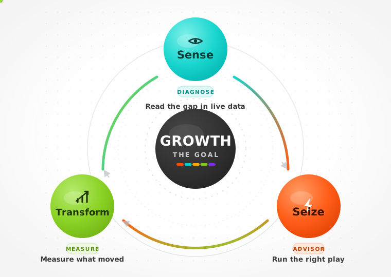
The Sense → Seize → Transform growth loop: a canonical motif, alongside the orbit hero and the 3R, 3P and Growth-Map diagrams.
Colors orbit. The core holds.
The Signal-Map combomark is the primary motion mark, and the equalizer is the same law at a different altitude: colored bars breathe on a still neutral ground. The live versions, the orbit hero included, run in the interactive manual above.
The recommended spatial system for digital work. Hierarchy comes from size, spacing and contrast, not from color alone.
| Rule | Value |
|---|---|
| Grid | 12-column responsive |
| Breakpoints | 375 · 768 · 1024 · 1440 |
| Spacing scale | A 4/8px rhythm; section spacing 16 / 24 / 32 / 48 |
| Measure | 60 to 75 characters on desktop, 35 to 60 on mobile |
| Layout shift | Give async and media blocks fixed aspect ratios to block CLS |
Buttons, dynamic states and tokens, from the Web Guidelines plus the orbit async-state spec. Radius 4px, Lato Bold, letter-spacing +0.02em, 120ms transitions. One primary CTA per screen.
When an action is working or resolving, the button reports it in place, never with a full-page spinner. A spinning cyan-to-orange orbit border signals loading; the shape then resolves to green success or red error. Geometry never changes between states. Run the lifecycle right here: each click goes idle, then loading, then the result, and auto-reverts.
| State | Border | Surface and text | Rules |
|---|---|---|---|
| Default | Orange, solid 1.5px | White surface, orange label | Interactive; hover inverts to solid orange |
| Loading | Cyan-to-orange orbit, spins once per second | Muted grey label | Disabled with aria-busy true; the label ends in an ellipsis |
| Active | Inherits the state border | Inherits | Presses down 1.5px while pressed |
| Success | Green gradient | Green tint #F1F8E1 surface, green label | Holds about two seconds, then returns to default |
| Error | Status-red gradient (a platform status token; there is no brand red) | Status-red tint surface | Stays interactive so the user can retry |
Reference the variables, never hand-type hex. The full token set (all five brand colors, shadows, neutrals, tints and the Lato @font-face set) ships in the hiilite-ai-brand package as colors.css and colors.json. Write to [email protected] for the current bundle.
| Token | Value | Use |
|---|---|---|
| –hi-orange | #FF4D00 | Primary accent and CTA |
| –hi-charcoal | #282828 | Text and dark surfaces |
| –hi-dark-grey | #393939 | Body text |
| –hi-light-grey | #F7F7F7 | Surface and canvas |
| –hi-font-body | Lato | All text |
| –hi-font-serif | Cardo | Editorial pull quotes |
| radius | 4px | Buttons and inputs |
The system applied: decks, email signatures and social avatars. Same colors, same marks, same voice everywhere the brand shows up.
Sound is not yet defined. This chapter is reserved for a future audio identity as the brand scales into video and product. No sonic assets exist yet: author them when video and product surfaces need them, and treat every direction below as a recommendation waiting for sign-off.
Where the approved files live, what rights govern them, and who owns each slice of the brand.
Every approved file downloads from the interactive manual above: the combomark (color and stacked), the wordmarks (color and white), the Hii icon set in all seven colors, and the animated orbit motion asset. Fonts ship with the brand package: Lato in ten weights, Cardo from Google Fonts. For print-grade vectors, Pantone swatches or the full bundle, write to [email protected].
Abide by Hiilite’s Terms of Service and Privacy Policy for any brand asset, and never place the brand in a negative or misrepresentative context. Only the shipped files are approved.
The five core values map to the five departments that own their slice of the brand. Brand questions and asset requests route through the owning department; Design holds final say on visual identity.
| Department | Color | Core value |
|---|---|---|
| Marketing | Orange | Collaboration |
| Design | Purple | Purpose |
| Content | Yellow | Positivity |
| Tech / Dev | Cyan | Badassery |
| Leadership | Green | Growth |
| Reference | Where |
|---|---|
| Guideline source | The hiilite-ai-brand package and this page, hiilite.ai/brand-guidelines/ |
| Authoritative spec | Hiilite · Web Guidelines (Dec 2020) |
| Contact | [email protected] |
If it is not in the changelog, it is not the brand. This page is Brand Guide v2.0.0; every deploy adds a dated row.
| Version | Date | Change |
|---|---|---|
| 2.0.0 | 2026-07-23 | Field Manual redesign: full 16-chapter guide, imported from the approved v8b direction; native Impreza sections + embedded interactive manual. |
| 1.0.2 | 2026-07-20 | Changelog version and date cells no longer wrap mid-date; the change column absorbs the width. |
| 1.0.1 | 2026-07-20 | Fixed the Charcoal preview in The Mark: the swapped white wordmark kept the combomark’s box and rendered skewed; marks now keep their true proportions on every field. |
| 1.0 | 2026-07-19 | hiilite.ai guide launched. Inherits the Web Guidelines (Dec 2020); adds the motion language, tokens, and accessibility ratings. |